Section 4: Adjusting the Statistical Overlay
In addition to adjusting the characteristics of the tests before application, you can adjust the parameters used to display the statistical overlay after the calculation has been performed. This sort of adjustment allows the user to get a good grasp, both qualitative and quantitative, of the nature of the activation maps obtained during the scan.
- From the Display menu, select Overlay Options... You should get a box which looks like this:
The Overlay Options box
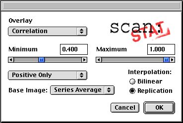
- In the box which appears, you can adjust many of the parameters used in the creation and display of the statistical overlay maps. For instance, click and hold on the box which says "Positive & Negative". This refers to the fact that pixels with positive correlations and pixels with negative correlations are being displayed. As you hold, you can notice that you have other options. Select "Positive Only" to eliminate all pixels with negative correlations. Notice how the display changes.
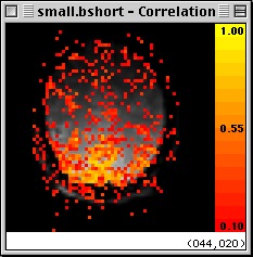
- Select Display -> Show Color Bar. A calibrated color bar should appear on the right side of the image. This bar indicates the color associated with different correlation values.
Adding a Calibrated Color Bar

- Another major change you can make is adjusting the range of correlations displayed by changing the maximum and minimum cutoffs. The default minimum is a correlation of 0.4, as you can see in the slider and display box just above the option box you were just working with. Click and drag the slider to the left until it is near the left side of its range, then release it. Note that many more pixels appear in the color overlay. This makes sense, as you have made the selection criteria much less stringent.
Displaying with a Lower Threshold
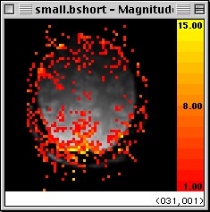
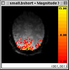
- You can also change exactly which statistic is being displayed. Near the top of the box, click and hold on the "Overlay" option box, which should currently read "Correlation". You will be presented with a menu of options. Drag the mouse to "Magnitude" and release. You are now given an overlay which represents the magnitude of activation for each pixel, in units of percent signal change. (for an explanation of how this statistic is derived, see Cohen, MS. "Parametric Analysis of fMRI Data Using Linear Systems Methods", NeuroImage 6:93-103, 1997. Only pixels whose percent change is within the range indicated by the sliders are represented. These ranges can be changed, just as you changed the correlation limits a moment ago.
Magnitude of Activation Display
- You might find it useful to include only those pixels whose correlation exceeds some limit of significance, say 0.5, but display those pixels' magnitude of activation. Foreseeing such a possibility, we have included such an option. Change the displayed statistic to "Correlated Magnitude" from "Magnitude". Note that a third slider appears in the upper right of the options box.
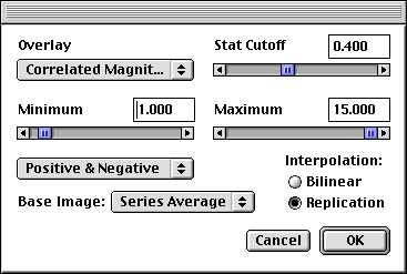
- This slider sets the correlation cutoff for which pixels to display. Set this at 0.5 by replacing the number above the slider with 0.5. The display will now show the magnitude (represented by color) of all pixels whose correlation with the paradigm reference vector exceeds 0.5.
Magnitude Thresholded by Correlation
- There are still a few options available. You can change the overlay to display -log(10) of the probability scores for each pixel, and you can change the manner in which the statistical data for each functional pixel is replicated to fill the space between them in the display. The default is Replication, which prevents the invention of false apparent statistics between pixels. However, some people prefer the look of Bilinear interpolation, which gives a smoother look. You can experiment and decide which you prefer.
Go back to the previous section
Go to the next section
Go back to the main page